Wednesday, April 18, 2012

Sorry about the lack of blogs lately, we're in the process of setting up a brand new TTAD website that will include a blogging platform. That blog will be updated on much more regular basis and should include all sorts of interesting things, including a little bit of TTAD backstory. Now on to this years(?) entry.


I wanted to give a formal shout-out and thank you to Jason Bienvenu creator of The Kingdom graphic novel for featuring a Trouble and Dangerous ad in his forthcoming issue #4. Jason does some pretty incredible work on his book and is coming off of a successful Kickstarter Campaign for a 6 part mini-series. Definitely check out his stuff, the first couple issues are going in sale this May.


Here's the artwork for the ad, this actually turned out to be a fantastic turn of events, as it forced me to think a little, and make some decisions, about how the promotional materials where going to look. Anyway, thanks again Jason!

Wednesday, September 14, 2011

Some Artwork


Not sure what this will eventually turn out to be, but it's turning out pretty well so far. Might be the chapter 1 cover, might just be some promotional artwork/poster. Who knows.

Monday, September 12, 2011

Future Chapters

We're getting down to the end of Chapter 1 and it's time to really start thinking about what Chapter 2 will be. I probably should have this figured out long ago, but here we are. There is a lot to consider, and the next two weeks are going to introduce 2 more characters that will be major figures in the story moving forward. There is also the main storyline... though at this point that is not the top priority.

I think the best thing to do is to try and write another adventure that is similar in format to this first chapter (ie, a central villain, with a plot and the hijinks therein), but there are a few other aspects to the character that need to be served. Mainly the alter-ego, which currently presents a little bit of a problem in that I don't know how interesting it will be.

I do have rough outlines for another 4 or 5 chapters (and vague ideas for a few more) but none of them really seem like the good fit for the second installment. A couple focus on the backstory of The Trouble and Kid Fury, but I'm not ready to get into that quite yet, I like that it's something of an unknown that will get filled in as we go.

Anyway my goal is to avoid an interval between chapters 1 and 2, I guess I need to think up some kooky villian and then write something around him/her. Maybe I can even work a little alter-ego stuff in there as well.

Friday, June 03, 2011

Miscellanous

Working hard on getting Chapter 1 completed. Not a lot to say on the blog front. We did set up an RSS feed for the comic, so if you like to read things that way it's now available with the artwork embedded in the feed. This feels kinda like a fluff piece, but this might be worthwhile, and it might work the same way with other comics you follow.

A cool aspect of RSS is you can integrate it into many things. Here's a few examples of how you can use our RSS feed along with Google Reader to see the comics on the iPad


Flipboard is a pretty popular app for the iPad, here's how the feed looks through that.


FLUD is another popular RSS reader program that works well with Google Reader.


Here's the regular website on the iPad, it works nicely as well!

Monday, May 30, 2011

Concept Art #1


This is one of the very first pieces of finished art I did for the Trouble and Dangerous. I hadn't added the outlines yet and the final version has the Batman-like nose/mask. Back in this version he still had the chevron markings on his forehead, I ended up dropping those and they were creating some weird uni-brow looking situation. I always liked the name Oppugnaut, he may turn out to be a real villain sometime down the road.

Also included is a sneak peak of Lynn who will be a major character.

Sunday, May 29, 2011

Making The Comic

It may or may not be apparent but the Trouble and Dangerous is created completely in Adobe Illustrator. As with anything this has some pros and cons. The major pro is that it's completely scalable and very easy to edit and tweak on-the-fly. I think the major drawback is that it can lack some of the expressiveness of a hand drawn comic and come out a little stiff sometimes as a result. This is something that will probably become less and less of an issue as the comic matures and I get better at making them/using Illustrator.

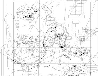
To give you a quick idea of what all is involved here's what page 2 of the comic looks like in "Outline" mode:


As you can see the Trouble is made of of several dozen ovals and what I like to think of as connective tissue. The characters are essentially modular in their construction, meaning they are made of of several main parts that are in turn made up of several more objects. It's a lot like how animators rig up 3D models with internal skeletons that allow them to move limbs and things around without having to redraw the character from scratch. I can basically move and rotate parts of the charator independently of each other and then fill back in the connective tissue. So for example if I want the charactor to look sad or defeated, I cam easily slump his head and shoulders to create the right kind of body language.

This actually illustrates another of the cons of doing things this way, there is a lot of production work before even the first comic is made. Introducing a new character also takes quite a bit of initial work.

This is a great way to learn Illustrator though, actually several versions have shipped since I first started this project. The newest version CS5 has 2 features that I am pretty excited about, first being the Width Tool that will allow me to make a stroke fatter or thinner as needed (This can be seen in the promo art posted in the last article). The other is the Draw Inside functionality that makes it much faster to create and use objects as clipping masks.

Promotional Art


Just a quick post to share some new promotional art we put together. This will become a post card that can be handed out at comic conventions and other places. Thanks to R Squared Studios for making it happen.

Chapter 1: The Soft Warm Glow of Villiany

I'm a little behind on posts, but Chapter 1 of the comic has launched and as of this writing has 4 pages online. As with any new endeavor this will take a little while to get going, but due to more traditional format of this comic I expect the first chapter will need to be completed before people can really begin to get a sense of the comic. A weekly schedule isn't the most ideal, but the pages are pretty complicated to make. Hopefully once I've been doing this for a little while we can move up to 2 or 3 posts a week.

Here's the cover and title page for Chapter 1:


The comic can be found at R Squared Comics, many thanks to them for hosting the comic and all their help so far. Stay tuned for more art and information.

Labels: